 Youtor
>> YOUR LINK HERE: ___ http://youtube.com/watch?v=Npusz3XA6cA
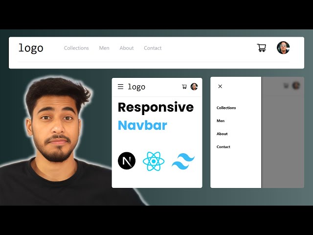
#reactjs #nextjs #nextjs13 #tailwindcss #coding #frontenddeveloper #navbar #reactwithutkarsh #utkarsh • Learn to build a responsive Navbar in React.js using Tailwind CSS! Perfect for beginners, this tutorial guides you through creating a sleek and user-friendly navigation component. Dive into web development with ease! • Subscribe to my channel for more web development tutorials! If you enjoyed building this feature, don't forget to like and turn on notifications for updates! • GitHub Repo for this Project ⬇️ • https://github.com/whoisseth/navbar-2 • Live Demo This project ⬇️ • https://navbar-2.vercel.app/ • Clean and Maintainable CSS Classes with • CLSX and Tailwind CSS in React- clsx() ⬇️ • • Clean and Maintainable CSS Classes wi... • Boost Your ReactJS Projects: Unlock the Power of • React Icons! - react-icons ⬇️ • • How to Use React Icons in React.js ... • Timestamps • 00:00 - Intro: ReactJS and Tailwind CSS tutorial overview. • 00:43 - Navbar: Mobile menu, sidebar, desktop links. • 01:18 - Setup: Next.js project creation with `npx create next-app`. • 02:53 - Project setup, default code removal, server start. • 03:39 - Navbar component creation (Navbar.tsx) in components folder. • 05:24 - Mobile Navbar: Flex layout, padding, and styles. • 06:35 - Menu button and logo creation in Navbar. • 10:03 - Cart icon, user avatar with React Icons and URLs. • 13:27 - Mobile sidebar: Close button, link additions. • 16:00 - Toggle mobile sidebar visibility with state. • 18:23 - Conditional classes, animations for mobile sidebar. • 21:02 - Desktop structure: Menu, logo, conditional links. • 23:45 - Desktop styling: Link styles, hover effects, margins. • 26:32 - Conclusion: Navbar completion for mobile and desktop.
#############################
